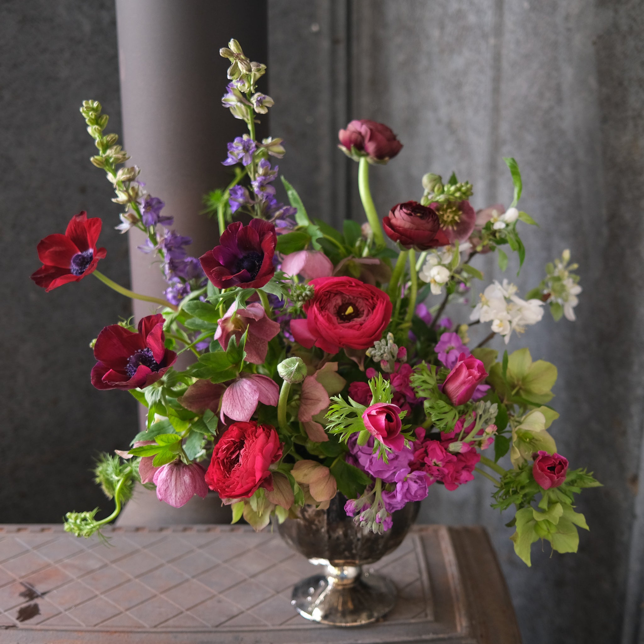
In the florist shop, the arrangements we create reflect the changing seasons both in our choice of flowers (dahlias, for example, are an outstanding late-summer flower) and in our choice of color palette. You'll notice that our September offerings trend toward the warm tones of late summer and autumn.
But what is a color palette, come to think of it? Why do we pair burgundy and orange and associate those colors with fall? And what are warm tones?
Color Theory
Terms like "color palette" and "warm tones" come from the collection of ideas known as color theory. Color theory is the language we use to talk about how colors work together as well as how they can make us feel. Though it sounds academic, color theory language is part of our everyday lives. If you've ever looked at a color wheel or upped the contrast in an image on your phone, then you've engaged with color theory.
How We Use It
The chief way that we use color theory language in the florist shop is in describing our arrangements' color palettes--broadly speaking, the range of colors included in each composition.
Though color palettes can be very specific, we most commonly describe our arrangements as featuring warm tones or cool tones. Warm tones include shades from red through yellow as well as brown and tan; cool tones encompass blue-green through blue-violet and most grays. While warm tones bring to mind daylight and sunset, cool tones evoke evenings and overcast days and seem calming and relaxing.
Other popular color palettes include feminine tones (pinks and purples), neutral tones (white and pale pastels), and jewel tones (intense pinks, purples, blues, and greens).
Colors and Feelings
While it's tempting to make generalizations about how colors affect people, responses to colors and color palettes are less like a math problem and more like an open-ended question: they involve our emotions and our judgments, and our responses can change over time.
For example, red is popular around Valentine's Day because it has romantic associations. But we also use red to communicate danger--think of the classic "big red button" or, more mundanely, of stop signs.
So how do you choose a color palette when ordering an arrangement? Our recommendation is to choose what the recipient likes best. If your friend will find pinks and oranges most comforting, then send them a vibrant arrangement during a difficult time. If the one you love is wild for green and blue, then sidestep the traditional reds next Valentine's Day and send them an arrangement in cool tones.


